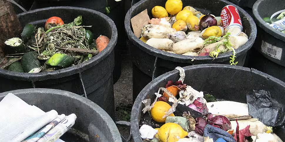
Food waste is a massive worldwide problem, with the west’s affluence sitting uneasily with the third-world starvation. But are all foods equally as likely to end up in the bin rather than our mouths?
Well, as these following infographics show, the answer to that question is clearly no.
Top of the pile are fruits and vegetables, with almost half all of those cultivated wasted, with meat and dairy significantly better at roughly 20% apiece.
But the story of food waste gets a lot more complex when the numbers are crunched, showing where and how the mistakes are being made. Take fish, for instance, which shows a low wastage level at just below 33%. But the statistics show that the waste gets an awful lot messier when the tables focus on North America and Oceania, it almost doubles. And most of that stems from consumer waste.
The graphs, created for the FAO's Food Loss programme are listed below:


[FAO]


