


With the ongoing migratory crisis gripping Syria and Europe, it’s easy for facts and figures to get mixed up with talk of swarms. But what does migration of people into and out of countries actually look like?
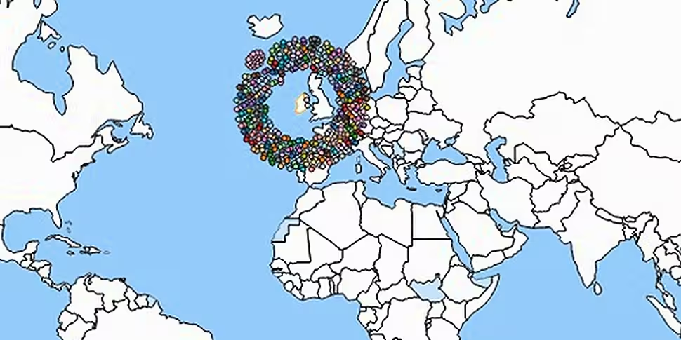
The International Organisation for Migration has created an interactive map that charts the inward and outward migration of the world’s population. Using data compiled b the World Bank in 2010, it allows users to see where people from a country are migrating to, and from where migrants to that country are coming.
To use it, simply click on a country and move your cursor over the dots to see where the people are coming from. Each coloured dot represents up to 20,000 migrants.
To view the visualisation map, click here.
Note re web browser requirements: To view the migration app you will require a modern web browser. If you are running Internet Explorer 8 or earlier you should download IE9 or any other modern browser such as Google Chrome or Mozilla Firefox.
[H/T: i100]


