


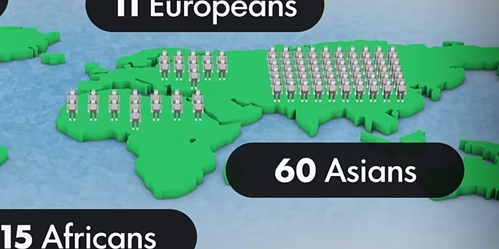
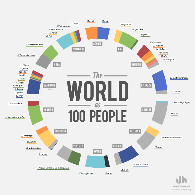
Back in 2011, the population of the world ticked over the 7 billion mark, a number that is quite difficult to visualise.
Among those billions exist different religions, cultures, nationalities and languages that make up the world, but spread across its huge population, the numbers are sometimes hard to grasp.
This short video from Good Magazine breaks down that data in a scale that's more easily digestible, taking a look at what the world would be like if there were only 100 people living on it.
It highlights the gap between rich and poor, as well as a number of other interesting statistics and pieces of data, from who has internet access to who has access to clean water.
The video takes its lead from the 100 People Project, where much of the data can be found, and which was also the basis for a number of interesting infographics from designer Jack Hagley.
Via Good Magazine


